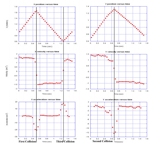
The position versus time graphs show the three collisions clearly. Note that the first collision is also visible in the Y data to a smaller extent as the wire, nominally parallel to the x axis, applies some force in the x direction due to misalignment, friction, and other complications.
The larger versions of the graphs are suitable for printing as transparencies.
Note that the acceleration spike is badly distorted by the numerical derivative, but the point is made that there is a spike. The shapes of these graphs rather than numerical values are quite instructive.
Data Files and Images: x data || y data